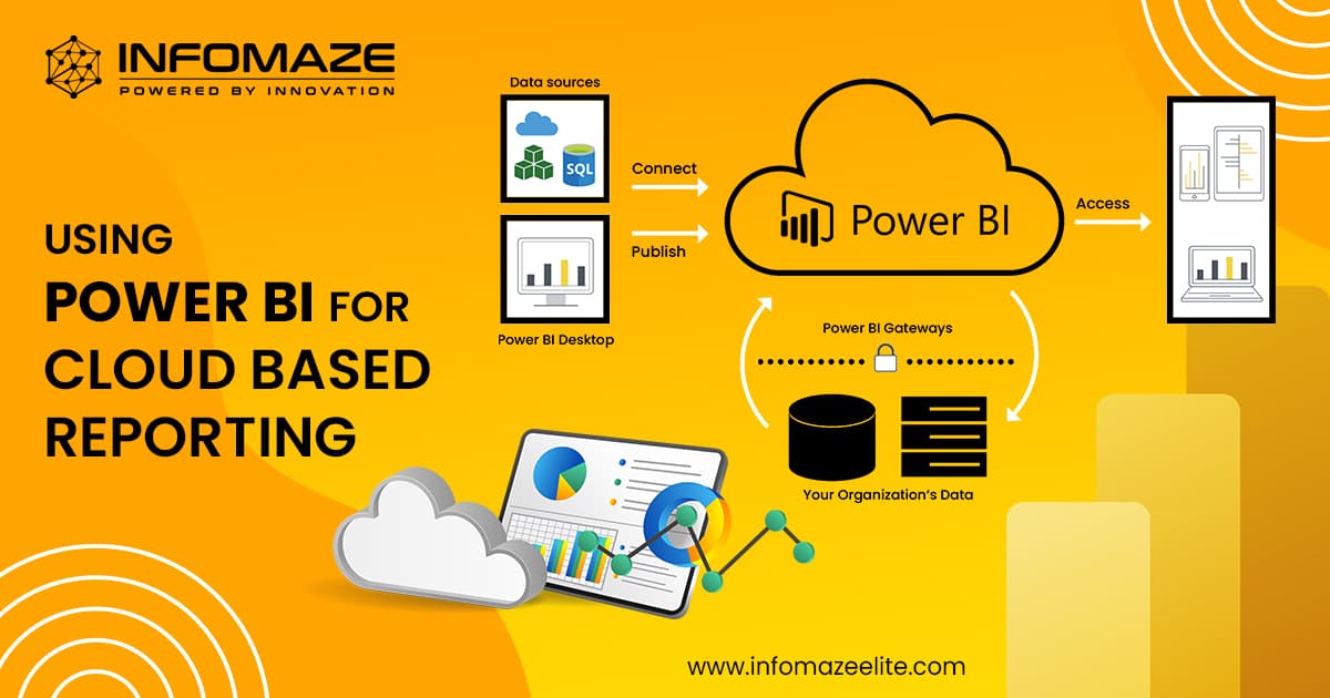
Power BI Custom Visuals: Building and Integrating Custom Visualizations
In the world of analytics and Business Intelligence, Power BI has become a powerful tool for organizations as it has the capability to transform your raw data into actionable graphic representations. This has been the default feature in Power BI but they have improved and advanced it and introduced Power BI custom visuals.
The Power BI custom visuals allow you to make customized Power BI solutions, where your data is represented in its pattern accurately.
In this blog, we’ll learn about the influence of Power BI custom visuals and the integration of Power BI and SharePoint will real-world scenarios.
What are Power BI Custom Visuals?
Power BI custom visuals are the visualizations that are created and developed by the Power BI community and developers outside Microsoft. On the bright side, these visuals can be added to Power BI reports and dashboards to boost the analysis data visualization. In other words, it converts raw data into graphical representations such as videos, images, charts, and diagrams.
Techniques of Power BI Dashboard Development
- Data Preparation and Modeling
- Visual Hierarchy
- Design Harmony
- Interaction
- Performance Enhancement
- Use of Custom Visuals
- Mobile Optimization
The Impact of Power BI Custom Visuals
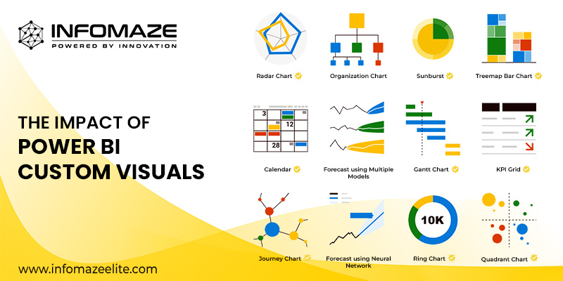
Power BI is a powerful tool. It has the ability to transform your data into actionable insights. Some data will not be accurate in visuals, so that’s why you need custom visualization. Here are some reasons with real-world scenarios:
Power BI Custom Visuals In Practical Scenarios
For a practical scenario, imagine you’re the head of sales in a retail company and you’re analyzing all the sales data. The default visualization in Power BI will not be accurate enough to represent the complex patterns in your data. Here’s why you’ll be building a Custom visualization.
Creating Custom Visualization: Sales Data
Select the Framework :
To work with Power BI, you’ll need to choose a framework. Power BI supports 2 frameworks to create your custom visuals: D3.js and Chart.js
- D3.js provides a level of flexibility and is suitable for customized visuals.
- Chart.js offers a simpler and user-friendly experience.
Install the necessary development tools :
Install the required developer tools such as Visual Studio, that are popular for developing and testing codes. These editor tools provide a set of utilities and templates to simplify the process.
Design the visual :
Plan and design it according to your requirements. Whether it is a special chart, custom map, or a unique table, the design has no limits. Ensure that your visuals convey the data effectively.
Implement and Test :
Now it’s time to implement the code, you can use TypeScript, JavaScript, or any other supported languages. The choice of language will define the appearance of the design. In the next step, you’ll test the code. This is a very important step in the entire process. You need to ensure that it runs properly without any errors or bugs.
Package and Publish :
This is the final step, after running the test and your custom visual is ready, pack it into a format that Power BI understands. The most used format is the .pbiviz file.
Integrating Custom Visuals
Import Custom Visuals :
First import your custom visual into the Power BI report. It can be done either from Power BI Marketplace or directly using the .pbiviz file.
Drag and Drop :
This is the easy part, after importing your custom visual, you can easily add the visual by just dragging and dropping them into a canvas. Configure them according to your needs.
Collaboration :
Custom visuals are very creative and interactive. This allows the users to click, filter, and examine in depth for more detailed insights. Adjust these interactions for a rich experience.
Power BI and SharePoint Integration

Publish to Power BI Service :
Ensure your Power BI report is published to the Power BI service.
Integrate Code :
Build a code for your report that needs to be shared on the SharePoint page.
SharePoint Page :
Make edits on the page where you want to add the report.
Embed Web Parts :
Add “Power BI” to the web part and paste the integrated code in the configuration settings.
Save and Publish :
The final step is always simple, save and publish the Sharepoint page.
The Bottom Line of Power BI Custom Visuals
Power BI customized graphics have reshaped data analytics and business intelligence. Power BI stands out as a versatile and effective tool for businesses due to its ability to build customized, interactive, and highly insightful data visualizations. This technology is at the forefront of modern data analytics, whether you are creating unique graphics to gain a competitive advantage or integrating Power BI into your SharePoint setting to enable better communication and data sharing.
Understanding the creation process, properly integrating the graphics into your reports, and embracing their ability to turn data into meaningful insights are the keys to success with Power BI custom visuals.
Power BI may sound complex but you can make it simple by telling us your requirements and we’ll do all the complex work for you. Infomaze has over 21 years of expertise and we are a trusted service provider as well. Our team of experts will work with you and give you all the updates required.
Connect with us now and open a door to the future with Power BI with Infomaze!!
Categories
- AI/ML (6)
- Application Migration (8)
- BI (7)
- Case Study (28)
- CRM (8)
- Dot Net (8)
- Informational Blog (71)
- IT Help Desk (8)
- Mern Stack (1)
- Microsoft 365 (2)
- Mobile Application (9)
- Offshore Development (10)
- Outsourcing Services (1)
- PHP (11)
- PowerBI (7)
- QuickBooks (6)
- ReactJS (4)
- SEO (14)
- SharePoint (3)
- Web Application (10)
- Xero (1)
- Zoho (15)
- Zoho Case Study (38)




Disclaimer: All rights belong to the owner. No Copyright or Trademark Infringement Intended.


